1. Introduction to Flexbox
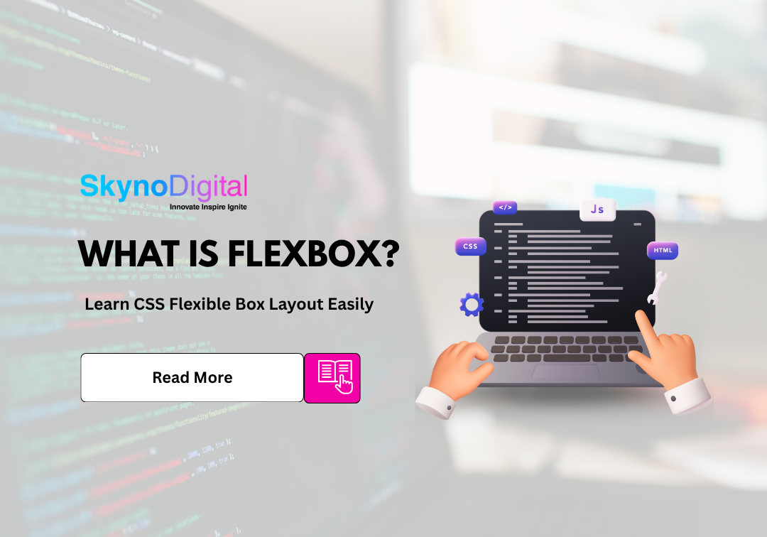
What is Flexbox?
Flexbox is a powerful CSS layout model designed to help developers create responsive and flexible web layouts with minimal effort. It allows elements inside a container to dynamically adjust their size, spacing, and alignment based on available space.
Unlike older layout techniques, Flexbox is built specifically for modern design needs, especially responsiveness across different devices. It works on a one-dimensional layout system (row or column), making it ideal for structuring UI components efficiently.
The concept and standards behind Flexbox are officially defined by the W3C, which ensures consistency and compatibility across browsers. This standardization is what makes Flexbox reliable and widely adopted in modern web development.
At its core, Flexbox operates on two axes:
- Main Axis → Controls the direction of layout (row or column)
- Cross Axis → Perpendicular to the main axis, used for alignment
Why Use display: flex?
Applying display: flex to a container unlocks a wide range of layout capabilities. Instead of manually adjusting margins, widths, or positions, Flexbox automatically distributes space between elements.
Key benefits include:
- Easy horizontal and vertical alignment
- Cleaner and more readable CSS code
- Built-in responsiveness without complex media queries
- Better control over spacing and distribution
This reduces development time and makes your layouts more scalable.
Difference Between Flexbox and Traditional Layouts
Before it, developers relied on:
- Floats → Originally meant for text wrapping, not layouts
- Inline block → Caused spacing and alignment issues
- Positioning → Required precise calculations and often broke responsiveness
Flexbox eliminates these limitations by offering:
- Automatic spacing
- Flexible resizing
- Easy alignment in both directions
In short, Flexbox replaces hacks with a structured system.
2. Getting Started with display: flex
How to Apply display: flex
.container {
  display: flex.
}
Once applied, all direct child elements become flex items and follow Flexbox rules.
Flex Container vs Flex Items
Understanding this distinction is crucial:
- Flex Container: The parent element that controls the layout
- Flex Items: The children that are arranged inside the container
The container defines how items behave, while items can have their own properties for fine control.
Basic Example of Flexbox Layout
.container {
  display: flex.
  gap: 10px.
}
. item {
  padding: 20px.
  background: #f2f2f2.
}
In this example:
- Items automatically align in a row
- Equal spacing is applied using
gap - Layout adjusts based on available space
3. Flex Container Properties
These properties control the behavior of all flex items.
flex-direction: Row vs Column
Defines the direction of the main axis:
row→ Items placed horizontally (default)column→ Items stacked vertically
Changing this property completely shifts how your layout behaves.
justify-content: Aligning Items Horizontally
Controls spacing along the main axis:
flex-start→ Items align at the startcenter→ Items centeredspace-between→ Equal space between itemsspace-around/space-evenly→ Balanced spacing
This is commonly used for navigation menus and evenly spaced layouts.
align-items: Aligning Items Vertically
Controls alignment along the cross axis:
stretch→ Items fill container height (default)center→ Vertically centeredflex-start/flex-end→ Align top or bottom
This is especially useful for vertically centering content.
flex-wrap: Wrapping Items
By default, items try to fit in one line. With flex-wrap, you can allow wrapping:
nowrap→ Single linewrap→ Items move to the next line
This is essential for responsive layouts.
align-content: Handling Multiple Rows
Works when there are multiple rows of items. It controls spacing between those rows and enhances layout readability.
4. Flex Item Properties
These properties allow individual elements to behave differently.
flex-grow: Expanding Items
Determines how much an item grows compared to others.
Example: If all items have flex-grow: 1, they share space equally.
flex-shrink: Shrinking Items
Controls how items shrink when space is limited.
This prevents overflow and ensures layout stability.
flex-basis: Initial Size of Items
Defines the starting size before Flexbox distributes extra space.
Think of it as the base width or height.
align-self: Individual Item Alignment
Overrides align-items for a specific item.
Useful when one element needs different positioning.
order: Changing Item Order
Allows visual rearrangement without modifying HTML structure.
This is helpful for responsive design adjustments.
5. Common Flexbox Layout Patterns
Centering Elements with Flexbox
Flex makes centering extremely simple—both horizontally and vertically—without complex calculations.
Creating Navigation Bars
You can easily align logos on one side and menu items on the other using justify-content.
Building Responsive Grids
By combining Flexbox with wrapping, you can create flexible grid systems that adjust to screen sizes.
Equal Height Columns
Flexbox automatically ensures all columns have equal height, solving a long-standing CSS problem.
6. Real-World Use Cases
Flexbox for Responsive Design
Flexbox is widely used in mobile-first design because it adapts layouts dynamically without requiring heavy media queries.
Flexbox in Modern UI Design
From dashboards to landing pages, Flexbox powers many modern UI components by ensuring consistent alignment and spacing.
When to Use Flexbox vs Grid
- Use Flexbox when working in one direction (row or column)
- Use CSS Grid when managing both rows and columns together
Using both together often gives the best results.
7. Tips and Best Practices
Avoid Common Flexbox Mistakes
- Not understanding axes (main vs cross)
- Overusing Flexbox for grid-like layouts
- Ignoring default values
Debugging Flexbox Issues
Modern browsers provide developer tools that visually show flex containers and item alignment, making debugging easier.
Browser Compatibility Tips
Flexbox is supported by all modern browsers but always test your layout across different devices and screen sizes.
8. Conclusion
Key Takeaways
- Flex simplifies layout creation
- It offers powerful alignment and spacing controls
- It improves responsiveness and reduces complexity
Final Thoughts on display: flex
Flex is not just a CSS feature—it’s a fundamental tool for modern web development. Mastering it allows you to create layouts that are clean, flexible, and future proof.
About Skyno Digital (CTA)
At Skyno Digital, we specialize in building modern, responsive websites that don’t just look good—they perform. Using advanced technologies like Flexbox, we ensure your website is optimized for every device and designed to convert visitors into customers.
Whether you’re a startup or an established business, our team helps you create a strong digital presence with smart design and strategic marketing.
Ready to grow your business online?
Connect with Skyno Digital today and let’s turn your ideas into high-performing digital experiences.


